

I am going to aim my magazine primarily at both males and females ages 16-22, my secondary audience is music enthusiasts of all ages who enjoy this genre of music,but perhaps won't as interested in all the features as my primary audience will hopefully be. As my magazine is based on a specific genre of music it makes the audience quite niche, meaning we will need to maintain a good reader writer relationship. In terms of uses and gratification, the social interaction they will gain is that they will be able to fit in with peers who share common interest. The magazine will affect peoples personal identity as the bands featured in the magazine will become roll model, and style icons to the teenage audience, the people featured in the magazine will possess idyllic lifestyles that the teenagers will aspire to have making them aspirers. Considering the hypodermic needle theory I will inform and praise the genre of music, rather than just instising and forcing them into my point of view about the music.
ANALYSIS


Kerrang music magazine cover is a lot more cluttered and a has a fairly 'old fashioned' house style. Different to NME it has 8 images on the cover rather than one main one. The mast head is large and takes up the top third of the page, although it is partially covered by the main image the iconic logo is still readable and noticed. The large main image isn't of a necessarily well known artist perhaps making the audiences for this issue slightly more niche, as Kerrang often appeals to a slightly older audience rather than 15 years plus, perhaps they are trying appeal to different new audiences. Many different fonts are used throughout making the page lack cohesion and less sophisticated, although as the genre is rock music, maybe they are trying to link the array of fonts with the lively musical genre. The stories around the side suggest that they are more interview based rather than review based like NME. At the top above the mast head, they have details of a competition where the reader has a chance to enter to win tickets to a very well known band enticing the reader to buy to gain more information. Also, they have put in a addition free offer of posters inside the magazine, they know that some people will buy the magazine simply because of that.
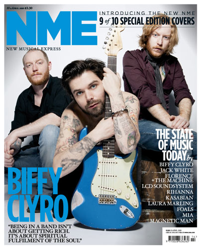
I think that the NME cover is much more successful in appealing to their target audience and suiting there interests that KERRANG, as NME has a more sophisticated and tidy house style, making it seem instantly more knowledgeable. The way that KERRANGs cover is full of images makes it less appealing to the eye, its feels as if they are trying to cram as much in as possible to attracted as many people are possible, whereas in NME they do this much more subtly with just a list of bands names, which are all musically different appealing to other audiences.
CONTENTS PAGE

Q magazine has a very structured and clearly layed out contents page, making it easily to navigate around, so that the audience can quickly find what they are looking for. As this is QsCourteeners, they are dressed in skinny jeans, t-shirt and have long hair, instantly having connotations of rock/indie music, which supports there genre of music. On the left hand side they have the features of the magazine, but they do not include every story that is in the magazine, they select the strongest articles which they know that there audience would like to read out. Stepping out of there generic colour scheme they have used gold text to draw attention to their main articles, Oasis is considered to be a very famous and sought after band, which they know there target audience will be interested in, highlighting this aims to encourage not only Q readers, but Oasis fans to buy this magazine.

Kerrangs contents page is different to the often quite basic layouts that most other music magazines choose. Instead of having one main image Kerrang used multiple images to support the features on the contents. In the top left hand corner there is a editor letter, where they give a brief summary of there opinion of something that is in the magazine that week. Down the left hand side there is a contents with different articles under various topics such as, Gigs, Live reviews, Icons, Swag. They still use there house style colour scheme of yellow and black on a white background. They use the yellow on certain texts and headlines to attract attention.
DOUBLE PAGE SPREAD

NME
Similar to NMEs house style, the layout of the double page spread is structured and neatly arranged. This main images takes up over half of the double page meaning there is little writing. There is also a very large heading, ' "people think I'm a attention seekers, but I'm just honest" ' The large statement is instantly what you read when you turn the page, the nature of the typography is very striking and reckless, which links to the main subject Lily Allens characteristics. Small hints of red around the text links both the pages and the image together giving a flow between the two different sides of the page.

KERRANG
Kerrangs double page layouts is similar to NMEs in that there is a large main image taking up one of the double page, they've chosen to use a strong image which reflects the genre and natures of the magazine/article. The articles is supported by a three further images, which are ascetically similar to the main image. There is not a large amount of writing on the double page, They have a section down the right hand side where they have reviewed the bands new songs, I think this section is successful as it add a new dimension and a interesting feature to the page. They've used words such as 'WORLD EXLUSIVE' but putting these in red and bold it instantly draws them to the audiences attention.

1. BLACK.WHITE.RED
This colour scheme is very suited the the genre of music which my magazine is based on. The colour are all very bold, and would look great on a front cover as it has connotations of danger and attitude, which could be linked the genre of music or the personality of some of the bands in the magazine. A disadvantage of this colour scheme is that it isn't very original and looks similar to other music magazines.
2. WHITE.BLUE.BLACK
This colour scheme is would be appropriate for the magazine as blue/white on the black would make a striking appearance if used on a magazine. However the connotations of the colour blue do not really suit the genre of the magazine, as it appears to be calm and peaceful. Although, I think that aesthetically these colours would be very suitable for the cover.
3. WHITE.BLACK.GREEN
This colour scheme would also be appropriate for the cover as the black and white create a base, and the green would be used to highlight certain stories and attract the audiences eye. However, green isn't a very strong colour so I don't think it would be a very beneficial colour to use as the colour scheme.
4. ORANGE.BLUE.WHITE
Differently to other the other colour scheme, this one doesn't have black in. I have chosen to use blue and orange as they are complimentary colours making them instantly more attractive and appealing. I don't think that colour scheme would suit the genre of music magazine, I think it would better suit a school, or factual magazine rather than a music magazine.
After asking 20 people who are target audience which colour scheme they would prefer on a new music magazine:
1. BLACK,WHITE, RED - 9
2. WHITE, BLUE, BLACK- 7
3. WHITE, BLACK, GREEN - 4
4. ORANGE, BLUE, WHITE - 0
MAST HEAD
I've decided to call my music magazine HYSTERIA,(an uncontrollable outburst of emotion, often characterized by irrationality, laughter, weeping, etc.)

This font is very structured and has a military feel, The clean straight format of the characters which are slightly distorted gives a reckless and casual feel. The nature of the typography has a connotations of attitude, and also reflects the characteristics of the genre of music that in in my magazine. I think this would be a suitable masthead for my magazine.

This font is similar to the one above as it has been distorted, however this more reckless than the one above. I think that this is too over the top for the masthead as it has been overly distorted and I feel that it wouldn't look suitable for the masthead.

I like this font as I feel it suits the genre of music which my magazine is based on, as it is quite rocky and the distorted effect makes it look reckless.

This font looks very busy and excitable due to the linear effects around the characters. This font would be suitable for perhaps a headline for a article but wouldnt suitable for a masthead as the font isn't strong enough to represent the entire magazine.
CONTENTS PAGE LAYOUT
LAYOUT ONE
This first layout looks professional and like it could be in a product. It has a simple layout that is easy to naviagateusally in on a contents page, which has a relation to the website. The contents section make the reader able to find what intrests them very easily and quickly find the page. I think that I will use the layout for my contents page as it looks very simple, clear but still effective.

LAYOUT TWO
My second possible layout is very different to the first. The placements of the section makes a dramtic difference in this. There is little writing on this contents page and it relys mostly on images. I've included a small area for a editors letter which I feel is a important part for a magazine as it builds a relationship between the reader and writer.

DOUBLE PAGE LAYOUT
POSSIBLE LAYOUT ONE
This layout has quite alot going on, however I feel this suits the genre of music magazine, and also the nature of the band which will be on the double page. I chose to use a few images on this layout as it could allow different views and intresting shots which will make the double page look more intresting. This layout doesnt allow alot of room for text, however people usally look at the images more so than the text. I dont think that this layout is the most successful, as it wouldnt be sutiable for my double page as it donest have the a very strong area for text.

POSSIBLE LAYOUT TWO
My second possible layout is very basic and simple. The area designated to the headline is very large and takes up the majority of a page, This would be good for a double page as it is very striking, so perhaps if there was a following double page to allow for more images and more text this would be appropriate. I wont be using this layout as it is too basic to work as a successful double page, I tihnk it needs more features to make it look more intresting.

POSSIBLE LAYOUT THREE
My third layout is the most successful and I will be using it for my double page. There is room for a large attractive headline in the top left hand corner, with lots of room for text to be intergrated around the images. On the right hand side of page there is room for a large full body image, which would look quite striking and appealing as a double page. This layout also allows for a large amount of text to be used, which make for a more in dept interview. Ive also allowed for more images to be used to support the text.

IMAGES
Choosing the right image is crucial in insuring the aesthetic appeal to the magazine. The right image set the tone for the magazine and also instantly suggests the genre and audience. When choosing the images that I want to use for my magazine I thought about many elements: shot, angle, colour, subject, location.


These are a selection of the images that I took. They all have a similar colour, quite dark, but bright areas to highlight, contrast has been changed to make the images look more defined. When choosing the image that I want to use in my magazine I chose what I thought was the most attractive image, by seeing what works best on each page, I will trial using different images in different places on my products to see which suits where. When taking these images I thought about the location where they we're taken, against a white wall (simple, and easily manipulated) against a brick wall (interesting image, perhaps to be used on double/contents page) and also outside which creates a more natural less posed image, suitable for double page or contents. I think that for my media products I will use the images that are the strongest, in that I mean the ones which attract the eye, captivate, and represent the audience/genre of magazine/music.
FINALS
COVER
This is my final front cover, over all I am pleased with its final aesthetics. After asking a focus group of my target audience what they like and dislike about my product, it gave me the chance to fine tune some of the features that I didn't notice or include. I feel that my front cover looks professional. If I was to change anything I would make the image for free offers look more subtle and professional. Also the text slightly overlaps the image, and in some place it is difficult to see.

CONTENTS

Overall I am pleased with my contents page, I feel it looks sophisticate and could be believable as a actual music magazine contents page. If I was to improve this I would make the H in the top left hand corner stand out more and be more representative and iconic of the magazine.
DOUBLE PAGE
I am happy with the final finish of my double page, however I feel this is the weakest out of all my pages, as it looks bare in places me, if I was to improve this I would make it look fuller and slightly more professional. I like the way that the image is intergrated into page, and the writing is fits in around it. However the two supporting images on the opposite page do not look professional enough.

